

Chart patterns are larger structures than a single candle or indicator reading — they’re shapes that form over dozens or hundreds of periods and reflect a slower shift in the balance between buyers and sellers. Head and shoulders, double tops, and double bottoms are among the most widely recognized of these structures, and while textbook diagrams make them look perfectly symmetrical, real charts are messier. Learning to recognize the underlying logic of these patterns — not just their idealized shape — is what makes them useful.
This guide covers what these patterns represent, how to identify them (and their imperfect real-world versions) on an actual chart, how to use the “neckline” to plan entries and targets, and the most common mistake traders make when hunting for these shapes.
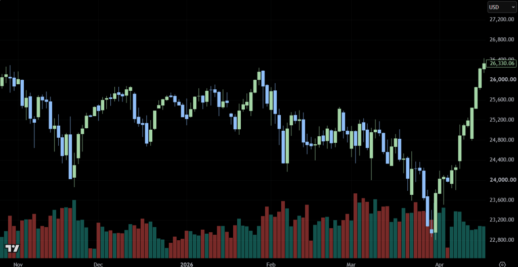
The chart above shows NAS100 on the daily timeframe from November through April. Notice how price repeatedly tries and fails to sustain a break above the 26,300–26,700 zone across November, December, and February — three separate attempts at a high, none of which held. Underneath, a rough support “neckline” sits around 24,800–25,000, tested multiple times before finally giving way in March, which opened the door to the sharp decline into the April low near 22,900. This is a realistic example of the logic behind topping patterns — it’s not a textbook-perfect head and shoulders, but the underlying story (repeated failure at resistance, a support line that eventually breaks) is exactly what these patterns are describing.
Head and Shoulders
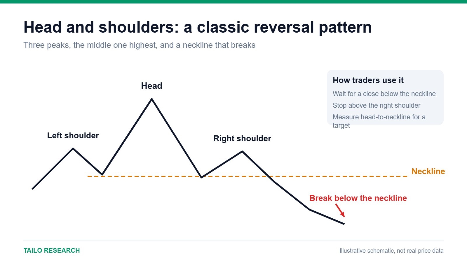
The classic head and shoulders pattern is a three-peak reversal structure: a first peak (the left shoulder), a decline, a higher second peak (the head), another decline, and a third peak roughly matching the height of the first (the right shoulder), followed by a breakdown. Connecting the two troughs between the peaks forms the “neckline” — the level whose break is generally treated as confirmation that the pattern has completed.
The inverse version — inverse head and shoulders — is the same structure flipped upside down, appearing after a downtrend and signaling a potential bullish reversal once the neckline above is broken.
Double Tops and Double Bottoms
A double top forms when price rallies to a resistance level, pulls back, rallies again to roughly the same level, and fails a second time — producing an “M” shape. It suggests buyers pushed twice and couldn’t generate a new high, which often precedes a reversal lower, especially once price breaks below the low formed between the two peaks.
A double bottom is the mirror image — a “W” shape formed by two comparable lows with a bounce between them — and suggests sellers pushed twice and failed to make new lows, often preceding a reversal higher once price breaks above the high between the two troughs.
Using the Neckline for Entries and Targets
The neckline (or the “M”/”W” midpoint level in a double top/bottom) plays two roles in these patterns:
- Confirmation: most traders wait for a clean break of the neckline before treating the pattern as valid, rather than anticipating the break in advance.
- Target projection: a common technique measures the vertical distance from the head (or the pattern’s peak/trough) to the neckline, then projects that same distance from the breakout point to estimate a potential target.
As with any projected target, this is a rough estimate rather than a guarantee — it gives you a reasonable place to consider taking profit, not a price the market is obligated to reach.
Why Real Patterns Rarely Look Like the Textbook
Textbook diagrams show perfectly symmetrical peaks and troughs. Real markets almost never cooperate that neatly — shoulders are uneven, necklines slope rather than sit flat, and there are often extra minor peaks and dips along the way, as the chart above illustrates. This is normal. The goal isn’t to find a picture-perfect formation; it’s to recognize the underlying behavior — repeated failure at a level, a support or resistance zone tested multiple times, an eventual decisive break — even when the shape is a little messy.
Combining Chart Patterns With Other Tools
- Checking whether the neckline lines up with an existing support or resistance level, which adds confluence to the pattern.
- Watching RSI for divergence between the two peaks or troughs — momentum failing to confirm a new high or low is a classic warning sign that often accompanies these patterns.
- Looking for a bearish or bullish candlestick reversal pattern right at the second peak or trough, adding short-term confirmation to the larger structure.
- Confirming a neckline break with MACD momentum turning in the same direction as the breakout.
Common Mistakes to Avoid
- Forcing a pattern onto a chart that doesn’t really show one, just because two peaks happen to be roughly similar in height.
- Entering before the neckline actually breaks, anticipating a pattern that may never complete.
- Ignoring the broader trend — reversal patterns that form against a very strong prevailing trend fail more often than ones aligned with slowing momentum.
- Setting overly precise targets from the measured-move technique and treating them as certain, rather than as one reasonable estimate among several.
Head and shoulders, double tops, and double bottoms won’t appear on every chart in a clean, obvious form, but once you learn to recognize the underlying behavior — repeated failure at a level followed by a decisive break — you’ll start spotting the logic behind these patterns even when the shape itself is imperfect.
For related reading, see our guides to Support and Resistance Levels, Candlestick Patterns, RSI, and MACD.
If you want to put these chart pattern concepts into practice, Vantage Markets gives you access to NAS100 and other major markets with competitive spreads and fast execution. Open a free Vantage Markets account and start applying what you’ve learned.
This content is for informational and educational purposes only and does not constitute financial advice. Trading CFDs carries a high level of risk and may not be suitable for all investors. Past performance is not indicative of future results. Please read our full Risk Disclaimer and Affiliate Disclosure before making any trading decisions.


Leave a comment