Hello, this is Tailo Research. Here’s today’s Nasdaq 100 (NAS100) technical breakdown, working through the weekly, daily, and 30-minute charts to map out where price is likely headed next.
Weekly Chart
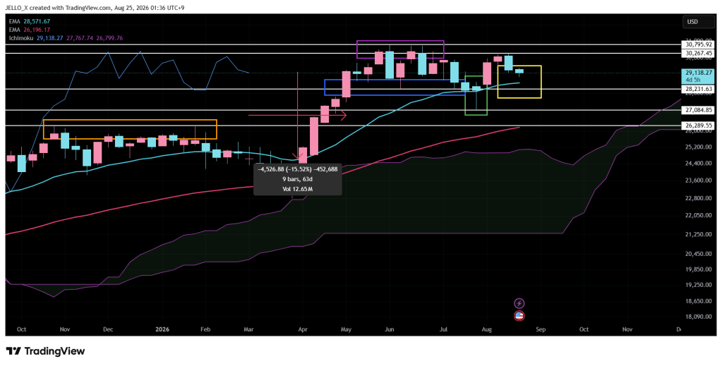
Nasdaq 100’s all-time high sits at 30,795. Looking at the weekly candles from August 10 and August 17, price failed to close back inside the body of that previous historical high zone (marked by the purple box), instead getting rejected around 30,267 and printing a bearish weekly candle.
On the weekly timeframe, the first short-term support to watch is the 20-week moving average near 28,570. Below that, the next support sits around 28,230 — the same zone that previously acted as support after price broke above the blue box high.
If that 28,230 level fails, the next support would be roughly 27,085, the lower wick of the July 27 weekly candle. Beyond that, the following support comes in around 26,290, which lines up with the resistance-turned-high zone that formed between the October 27, 2025 and January 26, 2026 weekly candles.
The moving averages are still trending higher, and the weekly candle remains above the 20-week line for now. The Ichimoku cloud hasn’t been broken to the downside either — a bearish shift there would require roughly a 15% pullback from current levels, or about nine weeks of sideways consolidation. The cloud itself currently starts around 25,080, still some distance below current price. One thing worth noting: the cloud starts to thin out from the week of September 28 onward.
Daily Chart
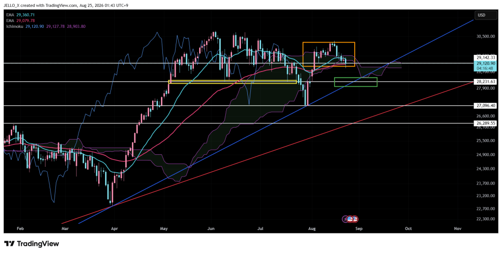
On the daily chart, Nasdaq 100 has been consolidating between the 20-day and 60-day moving averages, but price just printed a new short-term low. The 29,142 support — which had held since the large bullish candle on August 4 — was broken, and that break also took out the August 20–21 support, confirming a fresh lower low.
The uptrend that began on March 31, 2026 is still technically intact. However, if price breaks both the blue rising trendline and the 28,230 level at the same time, there’s a high probability of a deeper pullback toward a retest of the 27,096 zone. That area was a strong support zone, backed by the March–July uptrend and the yellow box that held as support from May 6 through July 23.
A simultaneous break of the trendline and that supply/demand zone would be an early signal of further downside. Given that setup, I’d treat fresh long entries — both short-term and long-term — with caution at current levels.
30-Minute Chart
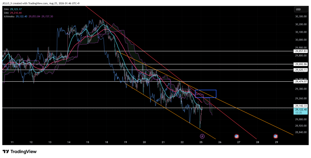
Zooming into the 30-minute chart, Nasdaq 100 is showing a bearish broadening (expanding) pattern along the orange trendlines. The key thing to watch here: even if the downtrend that started on August 17 gets broken, the broader bearish structure is likely to stay intact unless price also breaks above the upper boundary of the broadening pattern.
That said, 29,857 — the starting point of this pattern — lines up with a major resistance level. If price eventually breaks through that zone, it would represent a genuine bounce out of the broader downtrend, and a long entry could be considered once that breakout is confirmed.
Trade Alongside This Analysis
Starting tomorrow, I’ll also be publishing a daily trade journal covering exactly how these levels are traded in real time — entries, exits, and the reasoning behind each move — so keep an eye out for that if you want to see the plan in action.
If you want to trade Nasdaq 100 (NAS100) using the levels and setups covered in this analysis, Vantage Markets gives you direct access to NAS100 CFDs with competitive spreads and fast execution. Open a free Vantage Markets account and start trading NAS100.
This content is for informational and educational purposes only and does not constitute financial advice. Trading CFDs carries a high level of risk and may not be suitable for all investors. Past performance is not indicative of future results. Please read our full Risk Disclaimer and Affiliate Disclosure before making any trading decisions.
 Tailo-Research
Leave a comment